

A clean grocery shopping experience focused on simplicity and speed.
Role: UX/UI DesignDuration: 10 weeksTools: Figma

Overview
A calmer way to shop for groceries
Most grocery apps feel crowded, overwhelming and overly functional.
Grovia was designed to create a more intuitive shopping experience focused on simplicity, clarity and fresh organic products.
The goal was to reduce friction across the entire journey — from browsing products to completing checkout — while keeping the interface visually light and emotionally friendly.
The Challenge
Making grocery shopping feel effortless
The challenge was balancing rich product content with a lightweight mobile experience.
Users need to:
- discover products quickly
- navigate categories naturally
- manage carts easily
- complete checkout without frustration
At the same time, the interface needed to feel fresh, modern and approachable rather than transactional.
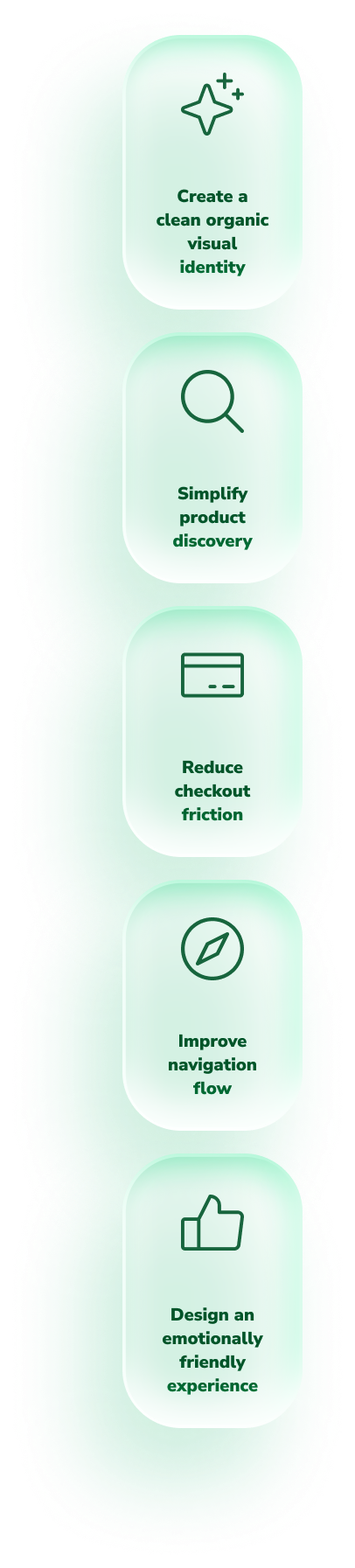
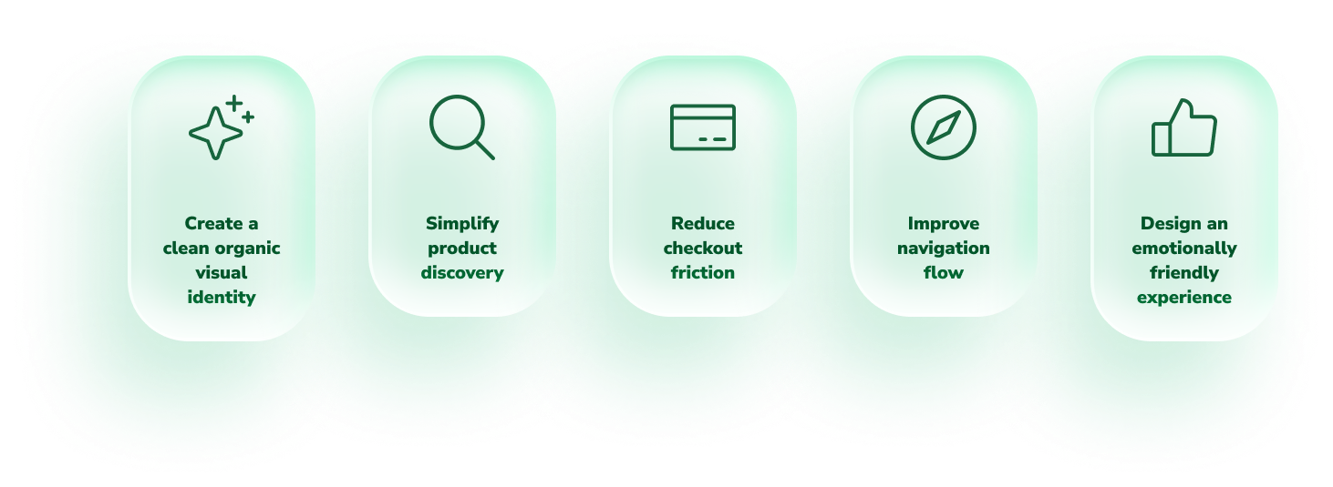
Design Goals
Focused on clarity and simplicity
User Experience Flow
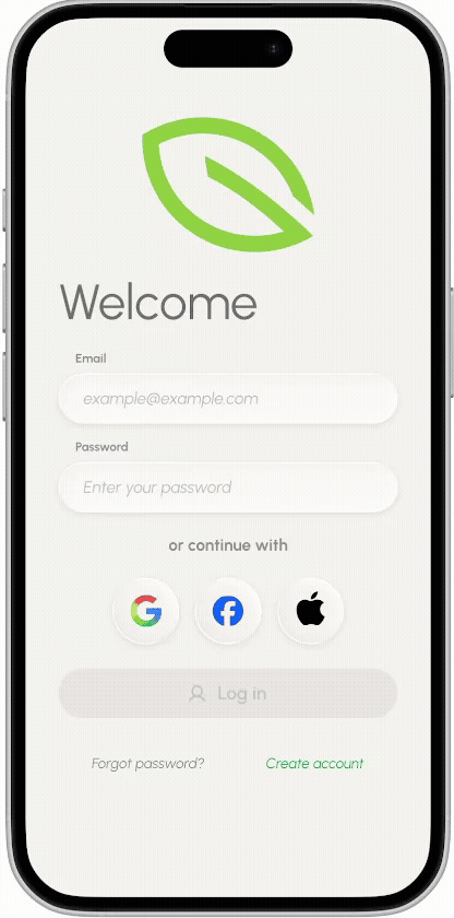
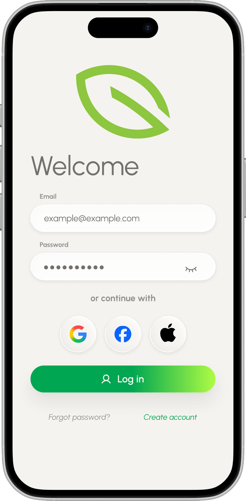
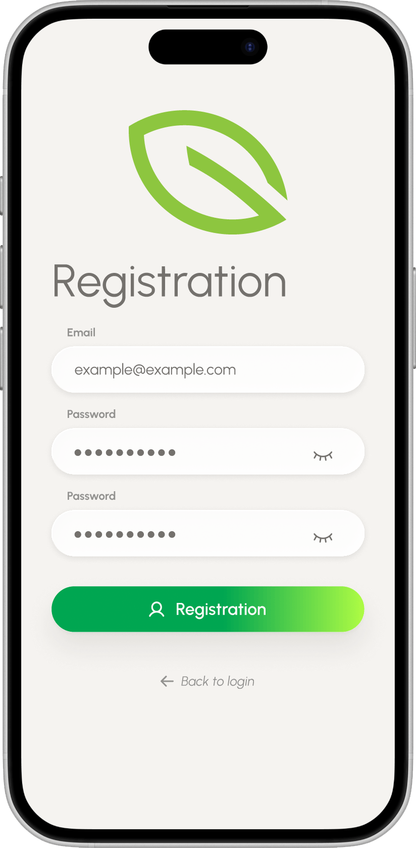
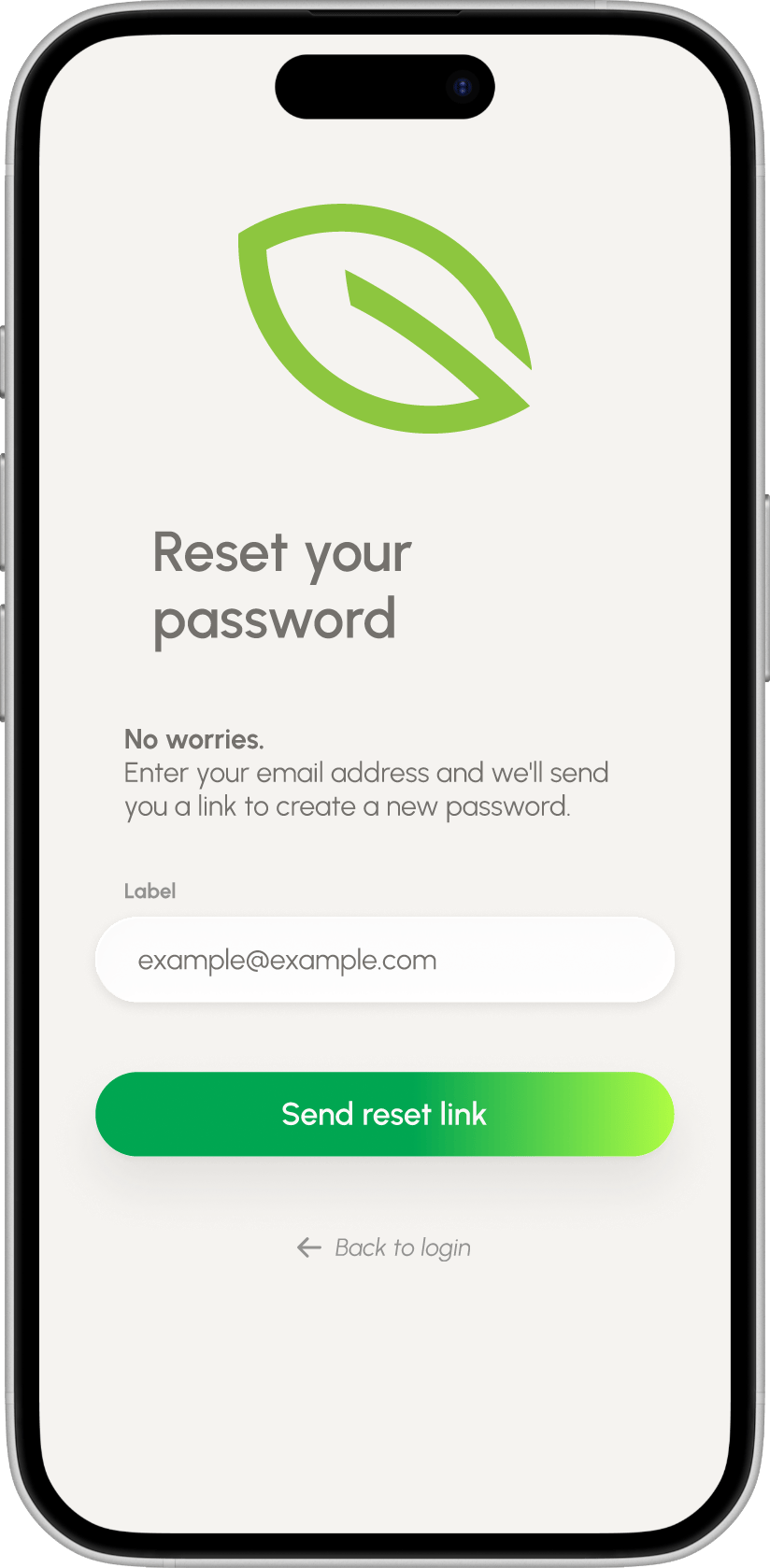
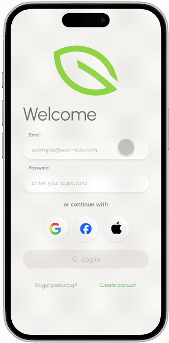
Seamless onboarding
Authentication screens were designed with minimal friction and clear actions to help users start quickly.
The onboarding experience uses lightweight forms, familiar interaction patterns and calm visual hierarchy.

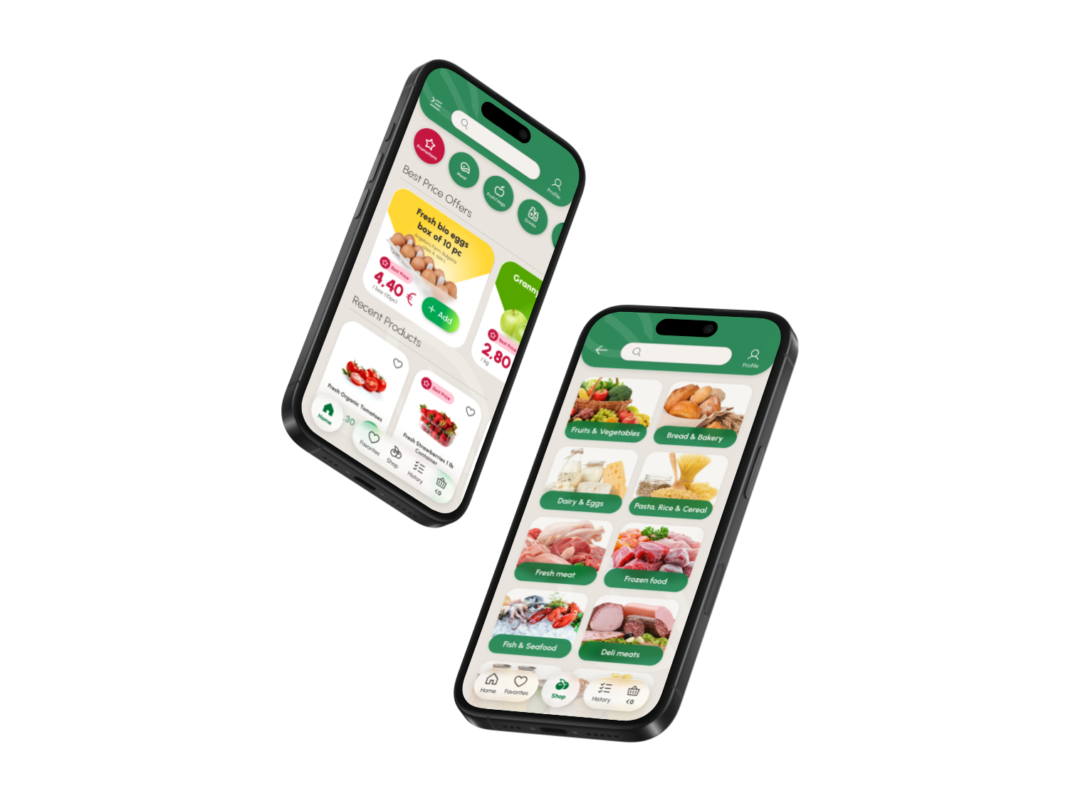
Product Discovery
Browsing made intuitive
The browsing experience focuses on visual product discovery through category-based navigation and clean product cards.
Large imagery, rounded components and clear pricing create a faster and more enjoyable shopping experience.
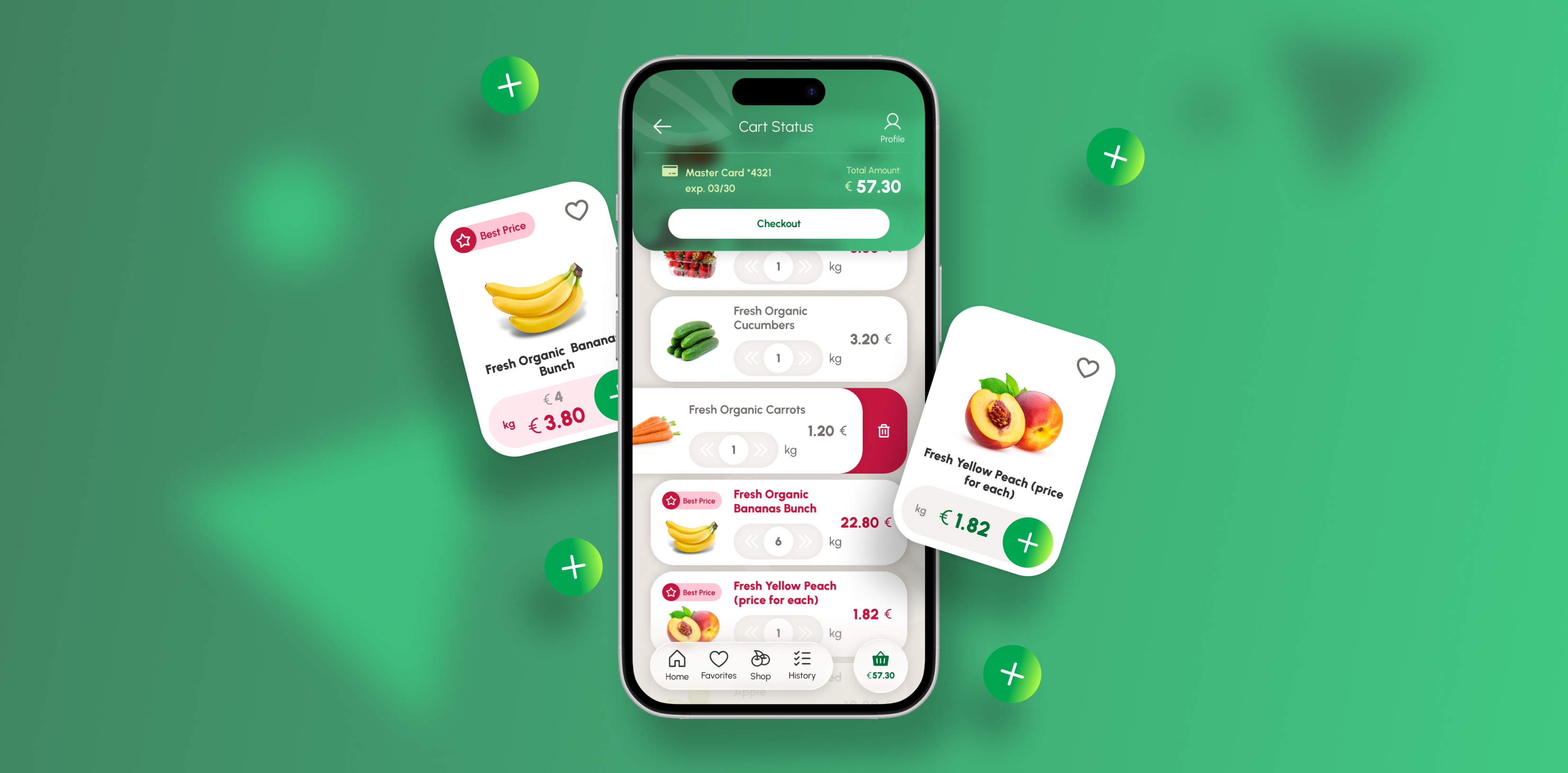
Cart & Checkout
A frictionless checkout experience
The checkout flow was intentionally simplified into clear, digestible steps:
- delivery
- payment
- confirmation
The goal was reducing cognitive load while maintaining clarity and trust throughout the process.
Visual Language
Fresh, soft and organic
Grovia’s visual identity combines:
- soft green gradients
- rounded UI components
- spacious layouts
- clean typography
- friendly iconography
The interface was designed to feel fresh and lightweight while supporting fast usability on mobile devices.
Key Features
Designed for everyday convenience
Features
- Smart category browsing
- Favorites management
- Lightweight authentication
- Clean product cards
- Simplified checkout flow
- Personalized profile section
Final Reflection
Simplicity creates better experiences
Grovia explores how thoughtful UX and clean visual design can transform everyday grocery shopping into a smoother and more enjoyable mobile experience.
The project focuses on balancing usability, aesthetics and emotional simplicity through a modern organic interface.
A clean grocery shopping experience focused on simplicity and speed.
Role: UX/UI DesignDuration: 10 weeksTools: Figma
Overview
A calmer way to shop for groceries
Most grocery apps feel crowded, overwhelming and overly functional.
Grovia was designed to create a more intuitive shopping experience focused on simplicity, clarity and fresh organic products.
The goal was to reduce friction across the entire journey — from browsing products to completing checkout — while keeping the interface visually light and emotionally friendly.
The Challenge
Making grocery shopping feel effortless
The challenge was balancing rich product content with a lightweight mobile experience.
Users need to:
- discover products quickly
- navigate categories naturally
- manage carts easily
- complete checkout without frustration
At the same time, the interface needed to feel fresh, modern and approachable rather than transactional.
Design Goals
Focused on clarity and simplicity

User Experience Flow
Seamless onboarding
Authentication screens were designed with minimal friction and clear actions to help users start quickly.
The onboarding experience uses lightweight forms, familiar interaction patterns and calm visual hierarchy.
Product Discovery
Browsing made intuitive
The browsing experience focuses on visual product discovery through category-based navigation and clean product cards.
Large imagery, rounded components and clear pricing create a faster and more enjoyable shopping experience.
Cart & Checkout
A frictionless checkout experience
The checkout flow was intentionally simplified into clear, digestible steps:
- delivery
- payment
- confirmation
The goal was reducing cognitive load while maintaining clarity and trust throughout the process.
Visual Language
Fresh, soft and organic
Grovia’s visual identity combines:
- soft green gradients
- rounded UI components
- spacious layouts
- clean typography
- friendly iconography
The interface was designed to feel fresh and lightweight while supporting fast usability on mobile devices.
Key Features
Designed for everyday convenience
Features
- Smart category browsing
- Favorites management
- Lightweight authentication
- Clean product cards
- Simplified checkout flow
- Personalized profile section
Final Reflection
Simplicity creates better experiences
Grovia explores how thoughtful UX and clean visual design can transform everyday grocery shopping into a smoother and more enjoyable mobile experience.
The project focuses on balancing usability, aesthetics and emotional simplicity through a modern organic interface.

A clean grocery shopping experience focused on simplicity and speed.
Role: UX/UI DesignDuration: 10 weeksTools: Figma
Overview
A calmer way to shop for groceries
Most grocery apps feel crowded, overwhelming and overly functional.
Grovia was designed to create a more intuitive shopping experience focused on simplicity, clarity and fresh organic products.
The goal was to reduce friction across the entire journey — from browsing products to completing checkout — while keeping the interface visually light and emotionally friendly.
The Challenge
Making grocery shopping feel effortless
The challenge was balancing rich product content with a lightweight mobile experience.
Users need to:
- discover products quickly
- navigate categories naturally
- manage carts easily
- complete checkout without frustration
At the same time, the interface needed to feel fresh, modern and approachable rather than transactional.
Design Goals
Focused on clarity and simplicity
User Experience Flow
Seamless onboarding
Authentication screens were designed with minimal friction and clear actions to help users start quickly.
The onboarding experience uses lightweight forms, familiar interaction patterns and calm visual hierarchy.
Product Discovery
Browsing made intuitive
The browsing experience focuses on visual product discovery through category-based navigation and clean product cards.
Large imagery, rounded components and clear pricing create a faster and more enjoyable shopping experience.
Cart & Checkout
A frictionless checkout experience
The checkout flow was intentionally simplified into clear, digestible steps:
- delivery
- payment
- confirmation
The goal was reducing cognitive load while maintaining clarity and trust throughout the process.
Visual Language
Fresh, soft and organic
Grovia’s visual identity combines:
- soft green gradients
- rounded UI components
- spacious layouts
- clean typography
- friendly iconography
The interface was designed to feel fresh and lightweight while supporting fast usability on mobile devices.
Key Features
Designed for everyday convenience
Features
- Smart category browsing
- Favorites management
- Lightweight authentication
- Clean product cards
- Simplified checkout flow
- Personalized profile section
Final Reflection
Simplicity creates better experiences
Grovia explores how thoughtful UX and clean visual design can transform everyday grocery shopping into a smoother and more enjoyable mobile experience.
The project focuses on balancing usability, aesthetics and emotional simplicity through a modern organic interface.